Enhancing Data Analysis with Cubes

Cube reports are designed to help you analyze your data more efficiently and effectively. These reports are crucial for your data analysis needs.
These matrix-style reports enable you to customize the layout of your data by dynamically selecting rows or columns. This flexibility allows you to display your information in the most effective way for your analysis.
The reports also include dynamic measures, accessible from the left-hand menu. For added convenience, you can select multiple measures or fields simultaneously using the CTRL (Windows) or Command (Mac) + click.
Cube reports are readily available across all our Power BI apps.
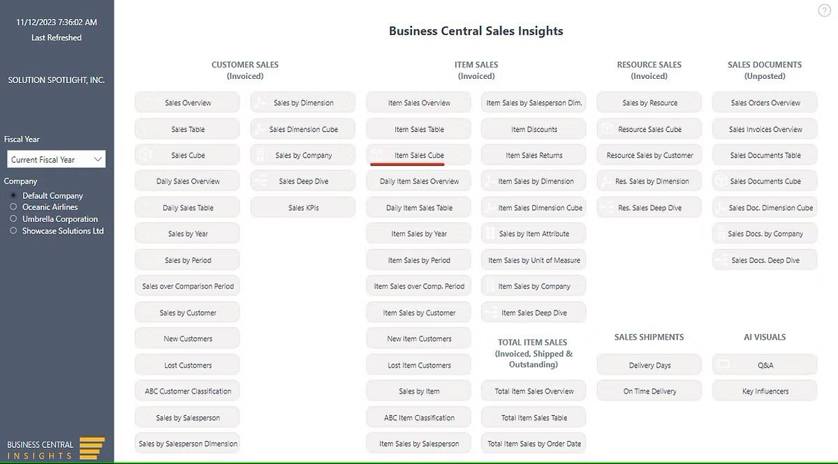
We will guide you through using the cube reports with an example: the “Item Sales Cube” report, available in the “Business Central Sales Insights” app
To start, open the Sales Insights app in your Power BI and navigate to the “Item Sales Cube” report.
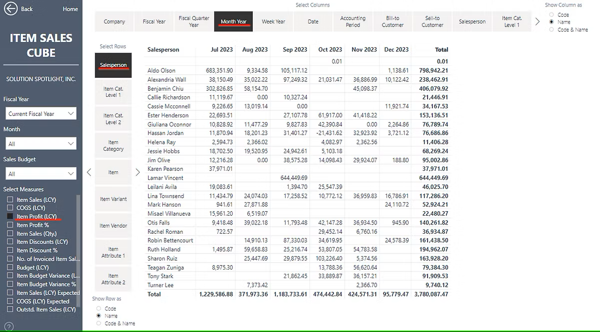
Example 1: Displaying Item Sales Profit by Salesperson and Month
To achieve this, select “Item Profit (LCY)” from the left menu. Then, choose 'Salesperson' as rows and 'Month Year' as columns.
Example 2: Enhanced Salesperson Analysis
Continuing from the previous example, we now aim to analyze each Salesperson's customers and the items these customers purchased. Additionally, we want to display the Item Profit % alongside the Profit amount.
To accomplish this, create row hierarchies by selecting multiple rows using the CTRL or Command + click function. Since 'Salesperson' is already chosen in rows from the previous example, now select 'Sell-to Customer' and 'Item'. Do this by pressing the CTRL or Command key on your keyboard and clicking on ‘Sell-to Customer’ and ‘Item’.
Select multiple measures in the same manner, by pressing CTRL or Command and clicking on 'Item Profit %'.
Finally, drill down (click on the 'Expand all down one level in the hierarchy' icon) to reveal detailed information about Customers and Items.
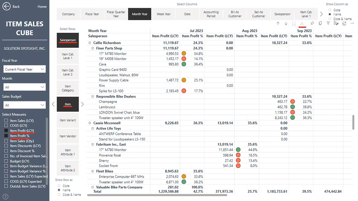
Please note that the order of selection is important. For instance, if you select 'Salesperson' first and 'Item' second, the hierarchy will place 'Salesperson' as level 1 and 'Item' as level 2. Conversely, if you select 'Item' first and 'Salesperson' second, 'Item' will be designated as level 1 and 'Salesperson' as level 2.
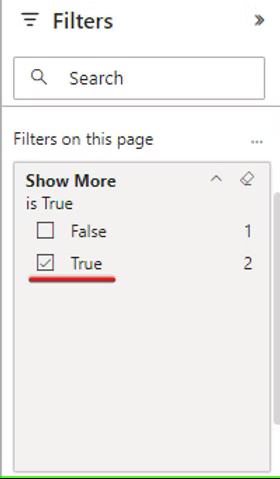
By default, not all fields and measures are visible. To display all available measures and fields, set “Show More” to True in the filters pane.
If a field or measure is not currently available, please reach out to us, and we'll make sure to include it in our upcoming product updates.
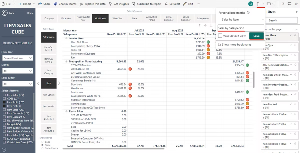
If you would like to reuse the report next time you can save selected measures, columns, rows, and filters by using Personal bookmarks.
 Analyse Data Across Multiple Currencies
Cubes support multi-currency reporting by allowing you to select different reporting currencies directly within the measures pane. This enables consistent analysis of financial and operational data across currencies, all within the same report. See how this works here:
👉 https://businesscentralinsights.com/multi-currency
Analyse Data by Item Attributes
Cubes allow you to break down your data using item attributes such as colour, size, or material. Once configured in Business Central, these attributes can be selected in rows or columns, enabling more detailed and flexible analysis across your reports. See how this works here:
👉 https://businesscentralinsights.com/item-attributes
Analyse Data by Units of Measure
With Cubes, you can analyse quantities and performance across different units of measure. Simply select the relevant unit in the rows or columns to view data in the format that best suits your reporting needs. See how this works here: