Analyze Business Central Insights Data in Excel

Analyze in Excel stands out as an exceptionally valuable feature, destined to be a favourite among all Excel users. Utilizing the Analyze in Excel feature, you can generate an Excel workbook that encompasses the complete semantic model of a particular Power BI report. This allows for the analysis of that semantic model in Excel through the use of PivotTables, Pivot Charts, and various other Excel functionalities.
There’s comprehensive online documentation about this feature. We recommend reading this article first.
Permissions required
To use Analyze in Excel, you must first have the correct permissions on the dataset, specifically, Build permissions enabled.
In your Power BI workspace just click the more options drop-down menu beside Semantic model. Then pick manage permissions. Once in that page then simply add the users and their relevant permissions.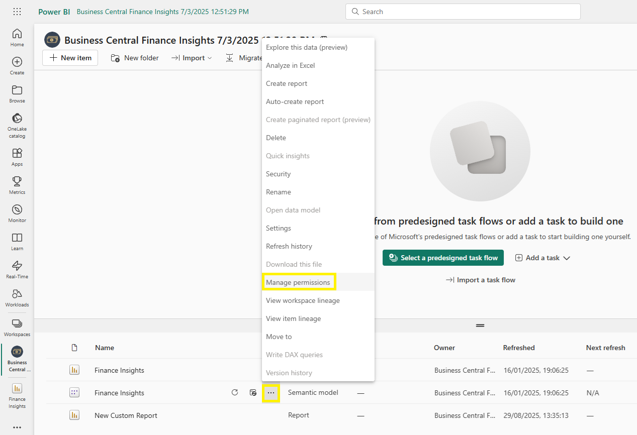
It is also essential that each user has installed the Analyze in Excel update via the download menu on the top right of the of the workspace.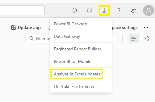
Note: Each user needs to have a Power BI Pro licence.
Option 1: Export data from a visual to Excel
You can export the data from an individual visual as an Excel file. In this example we’ll use the Total Sales table.
Open More options on the visual, select the three dots (…) in the top-right corner and choose Export Data from the drop-down menu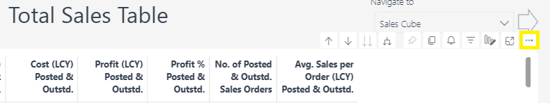 Pick an export type, you’ll see two choices:
Export with current layout: Gives you a like-for-like copy of what you see on screen, including totals, groupings, and basic formatting. Ideal for quickly sharing the exact view with colleagues.
Export summarised data: Exports the underlying aggregated data behind the visual in a clean, tabular format. Best for deeper analysis in Excel, e.g. building PivotTables, adding your own calculations, or combining with other datasets.
Click export and the visualisation will be exported as a .xlsx file you can open in Excel and from there you can configure your own reports.
Option 2: Analyze in Excel Web
In the Power BI service, open the Power BI App and select Export > Analyze in Excel. 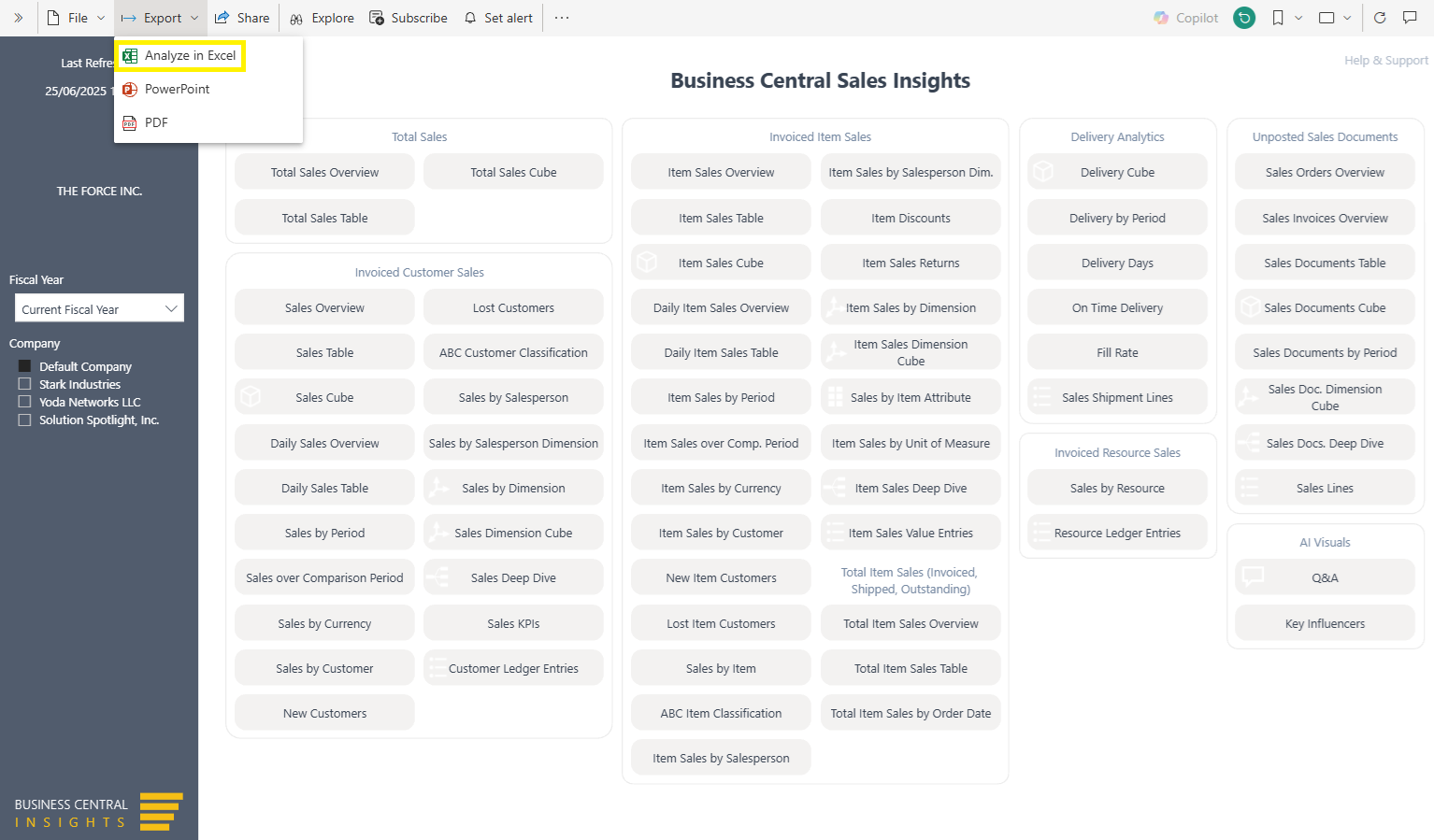
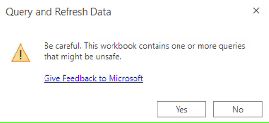
Power BI will create an Excel workbook. Once created it will prompt you to open in Excel Web. Select Yes to enable the Power BI query in Excel.
In Excel, you now have the capability to access the full semantic model, which includes all measures, tables, and fields. This enhancement enables you to effortlessly craft any type of report using a drag-and-drop interface, allowing for the straightforward selection of Filters, Rows, Columns, and Values.
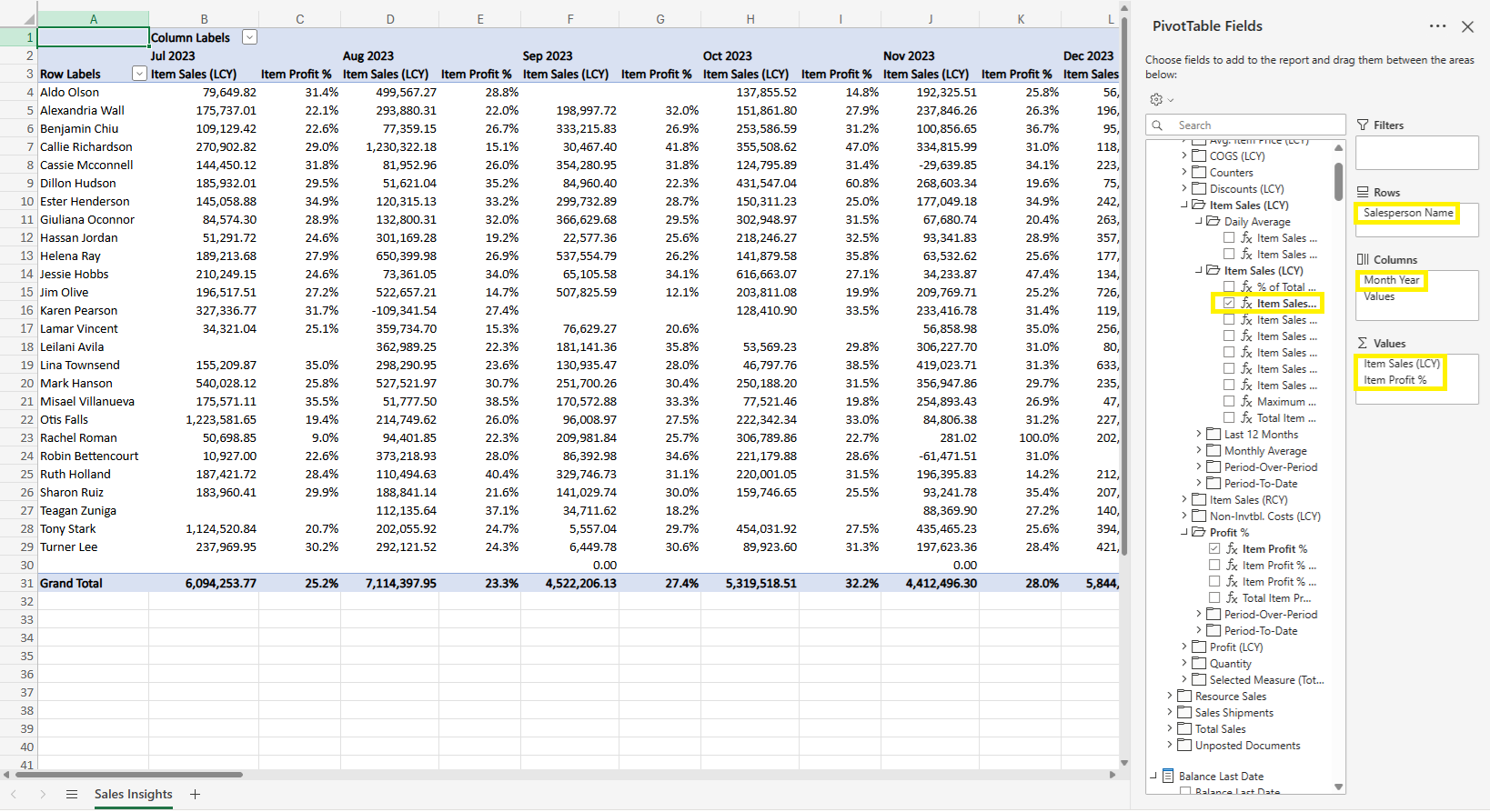
Note: It’s also important to be aware the ability to drill into your underlying data isn’t available in the web version of Excel. To access this in-depth functionality, you’ll need to use the desktop version.
Option 3: Analyze in Excel Desktop
From the Excel workbook created in the web version, click Editing in the top-right corner and then Open in Desktop.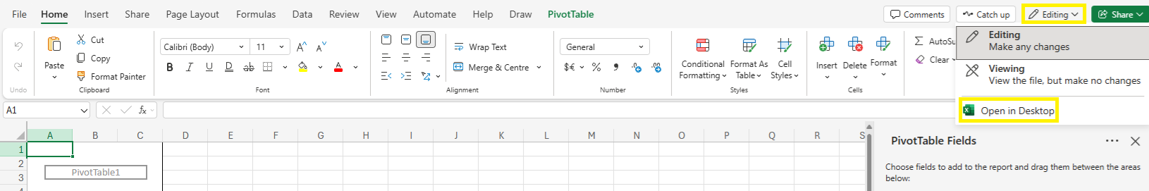
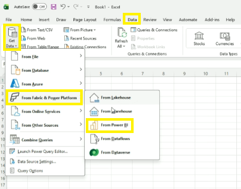
A further method to connect to the semantic models is to simply click: Data > Get Data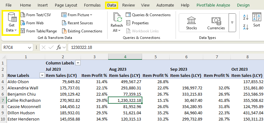
And in the drop-down: From Fabric and Power Platform > From Power BI. Use the right-hand panel to pick the relevant Business Central Insights app and semantic model. Click Insert PivotTable, then drag-and-drop fields to create your desired view.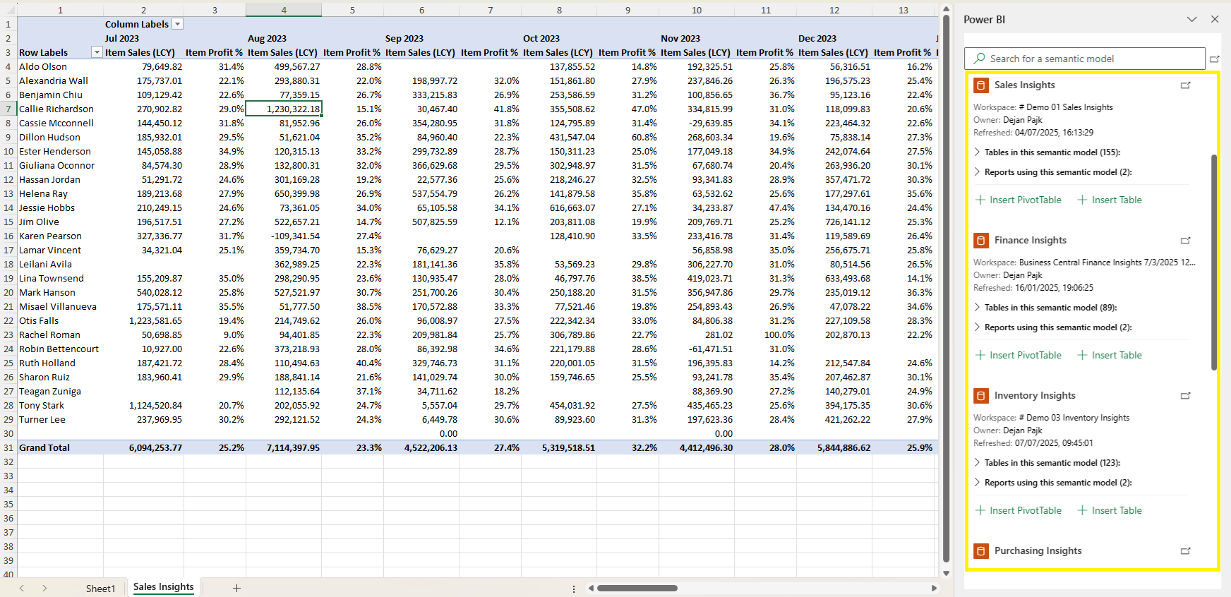
After you have created your report. To access more granular, transaction-level detail, you’ll need to drill-through. Just double-click on any cell in the sheet.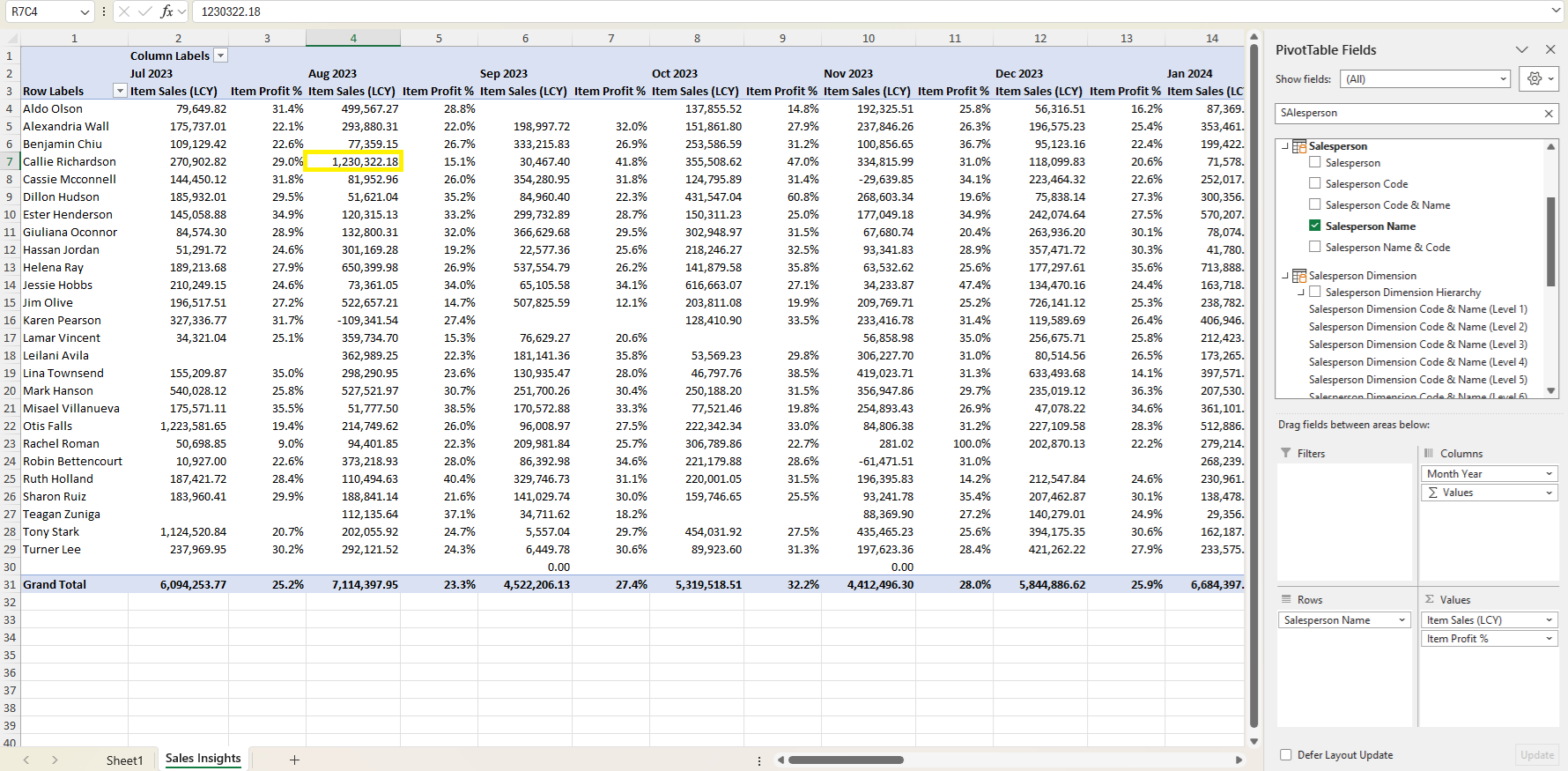
Excel will open a new sheet showing the underlying records that make up that value. This gives you complete transparency and access to the most detailed level of your data, all while staying in Excel.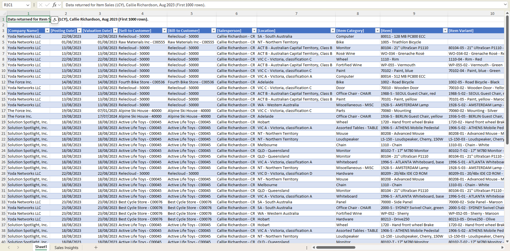
Another great advantage is that you only need to create the report once. Once you've created the report, you can save the Excel file, and the next time you open it, you can easily update data by selecting Data > Refresh.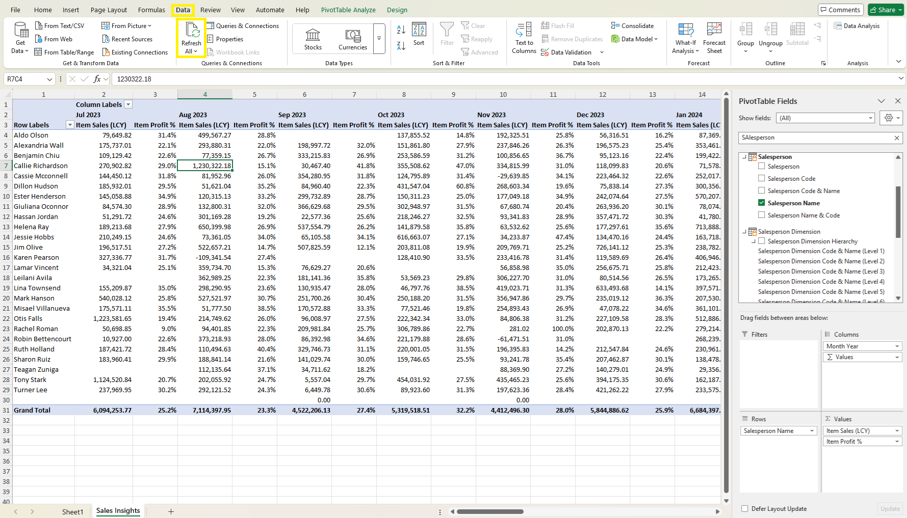 If you notice that a specific field or measure is missing, or lacks drill-through functionality, please inform us. We value your feedback and will work to include it in future versions of the product.
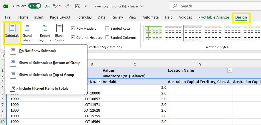
How to Display Tabular Layout
Using a tabular layout in Excel when working with PivotTables helps make your data easier to read, analyse, and export. Each field is displayed in its own column, labels are clearly repeated on every row, and the layout resembles a clean, database-style table.
You can enable a tabular layout and control how labels and subtotals appear using the following steps:
Show or Hide Subtotals:
Go to Design > Subtotals to turn subtotals on or off.
Switch to a Tabular Report Layout:
In Design > Report Layout, select Show in Tabular Form to display each field in its own separate column.
Repeat Item Labels on Every Row:
Still under Design > Report Layout, choose Repeat All Item Labels so every row includes the full set of labels.
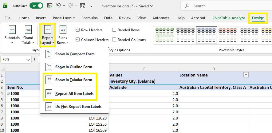
Using the Design > Report Layout dropdown you can show in a tabular form and repeat all the item labels on every row.
How to switch from your current Semantic model to a new Semantic model
Open a new sheet in Excel desktop
Click Data > Get Data > From Fabric & Power Platform > From Power BI
Click Data > Properties > Definition > Copy the Connection String
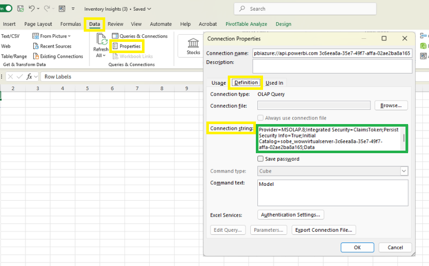 2. Return to the current sheet
Click Data > Properties > Definition > Paste the new Connection String > OK